Website re-design for Citizen Ticket
Duration
March 2022 - July 2022
Role
UX designer
Categories
Website, Re-design, User research
Team size
4
The challenge
The challenge for this task was to take a total of 11 separate pages and re-design them to create a improved structure and design for the user to have a better experience using the Citizen Ticket website.
Citizen Ticket is an online ticketing platform, hosting in-person, online and hybrid events with an ever-expanding showcase of features.
Initially, the brief was to take their 4 "services" pages and re-design these from the bland and broken plain white pages they were to match the calming and friendly tone of their internal platform for organisers and customers.
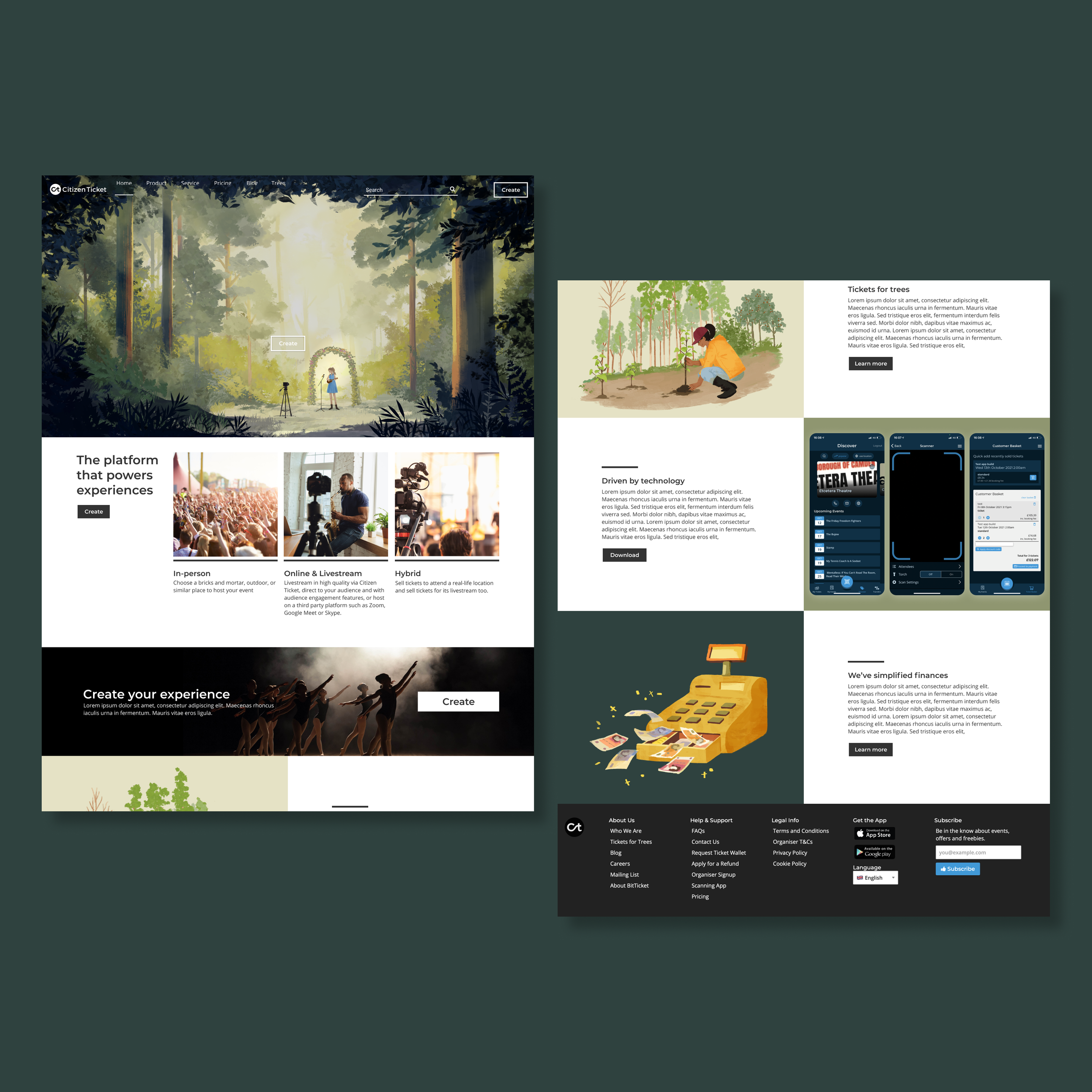
Once the designs for this were complete it was requested that the homepage also get a re-vamp, however, the style direction given for this was "edgy" and "AirBnb vibes". Amongst the excitement of getting to re-design the homepage was the thought that the newly implemented other page designs would no longer match the style of the homepage, or the internal platform for that matter, due to a dashboard transformation. I suggested the idea of working on these designs in between other projects and the idea was taken on board.
The result was a re-invigorated and re-shuffled design of 4 pages; Services, Product, Pricing and Homepage. These 4 pages replaced the old 11 that site previously had.
The designs - iteration 1
Out with the old…
To give a taster of what was on the website at the time, take a look at a few of the pages to the right. They were bland, boring and broken. There was very minimal content, and it took the idea of whitespace to a whole new level.
Services
- Finances
- On-site support
- Customer support
- Sales
Product
- Bookings
- Ticketing
- Live streaming
- CRM
- Organiser toolbox app
- Marketing
- Email centre
- Customer features
- Blockchain

… in with the new
Before starting the new designs I opted to conduct a card sorting exercise with members of the team as I wanted to minimise the number of pages and establish which content should belong on each page.
The results of the card sorting exercise showed that the new pages should be named Services and Platform with the following content.
-
Finances
On-site support
Customer support
Sales
Contact form
-
Event management
Organiser toolbox app
CRM
Marketing
Ticketing and more


The pivot - Iteration 2
It was during this point in the re-design of the pages on the website that I was asked if I’d also take a look at re-designing the homepage. This page wasn’t initially in the scope of the re-design as it looked much better than the others as it was updated more recently. However, the look that the company wanted to move towards was ‘edgy’ and ‘airbnb-like’, so I put some options together for the founders to choose from, and together we made a few changes.
In the back of my mind was the thought that the pages I just had just designed would no longer match the style of the homepage the founders were after, so I asked if they’d be up for me working on this alongside my other pieces of work. So I spent some time giving these a re-vamp too. The founders wanted to keep the illustrated images, but I as the company wanted a more professional look, I suggested we swap the hero images for photos instead.