Website re-design for Citizen Ticket
Turning a creative hobby into a real business sounds simple. It isn’t. Here’s what worked for me—no theory, just the steps that paid off.
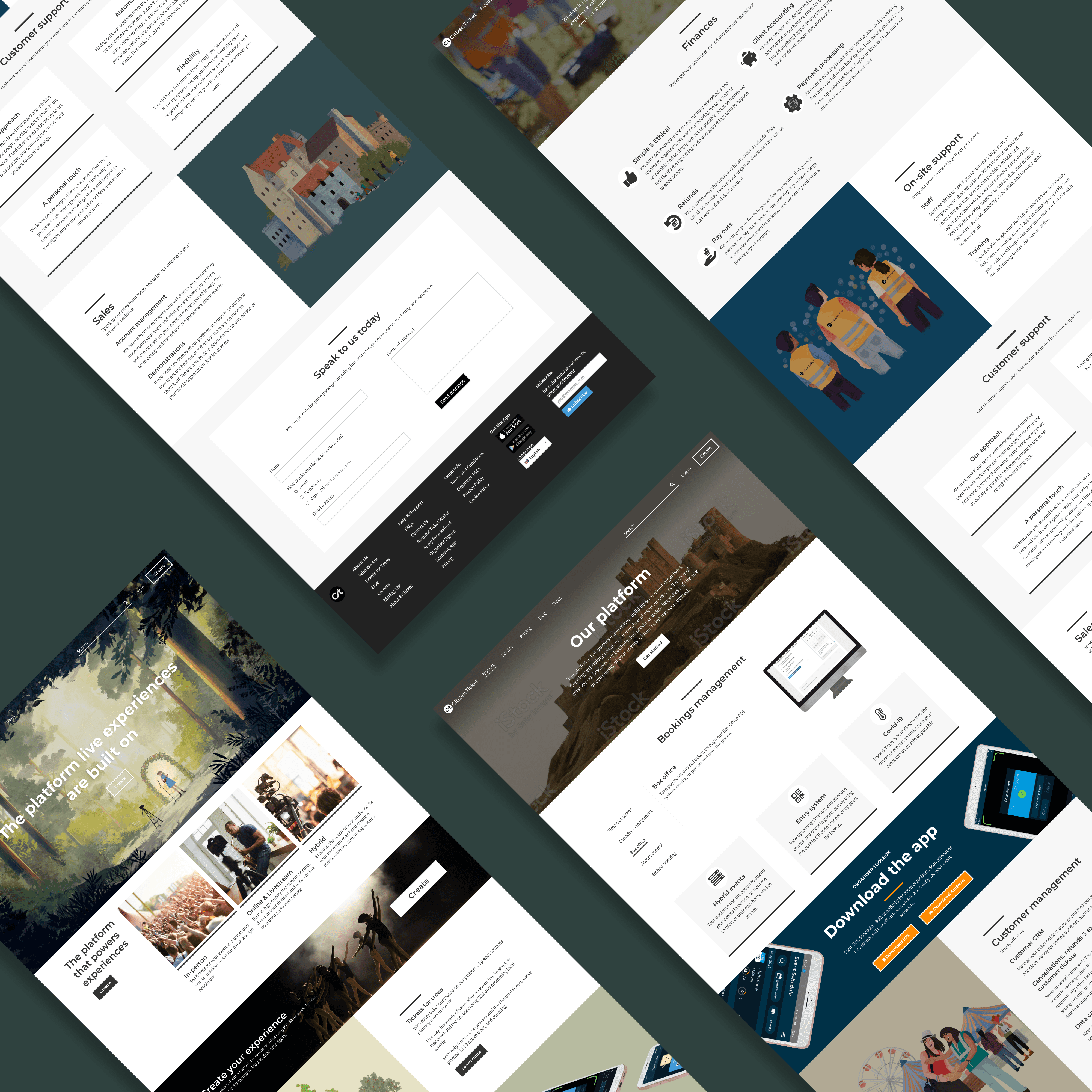


The challenge
The challenge for this task was to take a total of 11 separate pages and re-design them to create a improved structure and design for the user to have a better experience using the Citizen Ticket website.
Citizen Ticket is an online ticketing platform, hosting in-person, online and hybrid events with an ever-expanding showcase of features.
Initially, the brief was to take their 4 "services" pages and re-design these from the bland and broken plain white pages they were to match the calming and friendly tone of their internal platform for organisers and customers.
Once the designs for this were complete it was requested that the homepage also get a re-vamp, however, the style direction given for this was "edgy" and "AirBnb vibes". Amongst the excitement of getting to re-design the homepage was the thought that the newly implemented other page designs would no longer match the style of the homepage, or the internal platform for that matter, due to a dashboard transformation. I suggested the idea of working on these designs in between other projects and the idea was taken on board.
The result was a re-invigorated and re-shuffled design of 4 pages; Services, Product, Pricing and Homepage. These 4 pages replaced the old 11 that site previously had.
The designs - iteration 1
Out with the old
To give a taster of what was on the website at the time, take a look at a few of the pages below. They were bland, boring and broken. There was very minimal content, and it took the idea of whitespace to a whole new level.
In with the new
Before starting the new designs I opted to conduct a card sorting exercise with members of the team as I wanted to minimise the number of pages and establish which content should belong on each page.
The results of the card sorting exercise showed that the new pages should be named Services and Platform with the following content.
Be the first to know about every new letter.
No spam, unsubscribe anytime.